Monday, November 29, 2010

Final Group of Photos


The photographs in my series attempt to portray the human presence within apparently deserted spaces scattered with banal objects. The items are generally set askew and a certain emptiness in the frame calls for a human to be present. The crookedness of the picture frames on a stairway wall reference a person hitting up against the wall while ascending up the stairs.

Adding to this feeling is the domestic setting in the photographs. Within each scene, there is a biographical component suggesting the into the private life of whomever inhabits this space. The hanging of a shirt, the thrown bathroom towels and an unkept iron are regular routines performed alone in the home. The solidarity of some of the objects and quietude within seems to refer to a single human occupying the domestic setting.

Building to the mystery of the isolated scenes is the use of theatrical and unnatural lighting which refers to film. A narrative is created in which the movement of the implied person is tracked along the home. The lighting furthermore makes the simple and mundane appear paranormal with red or blue lights emanating from the objects themselves. These simple tasks are elevated in significance and represent the person.

Thursday, November 11, 2010

Work-in-Progress 4


In this batch of photos, I wanted to further explore the power of lighting and generate a more unusual look. The strong blues and reds adds a paranormal feel to the photographs. I also decided to experiment with sizing by cropping the photos to fit a 17x22 sheet of paper which I find to illustrate the narrative quality more successfully. I will continue to experiment with the color fluorescent lighting. Even though the first image seems awkward with the other images, I wanted to try scenes in which objects are missing, leaving a surrounding border. Out of the current images, I feel the last two are the strongest and get to the human presence the best.

Quiz 3


My series was most influenced by the photographs from chapter 2 "Once upon a time" and chapter 4 "Something about nothing". The first chapter talks about the connection between film and photography and the narrative quality that photographs tend to exhibit. These narrative range from overt storytelling to more subtle narratives. The second chapter focuses about photographs without people and how we the viewer experience these photographs. The lack of humans causes us to look at objects that is often left ignored and the viewer sees the world in a different perspective.

Christopher Stewart's photograph on the top reference cinema with the lighting of the room and the posture of the man. What surprising about the photograph is the unstaged component of the scene. Stewart's cinematic touch in his lighting and the way the composition alludes to to past films is interesting. I was influenced by the simple compositions of Stewart and the way the everyday lighting can have different meaning in the photograph. The lamp in the photo has a completely cinematic quality.

Laura Letinsky's phtograph in the bottom takes inanimate objects and adds a human quality to the objects. Her series of food in between meals draws attention to a moment of time that most do not notice. The tossed objects and unorganized objects shows action in which we can imagine someone tossing the fork or napkin after finishing their food. This way of portraying objects influence my own series in which I attempt to do the same thing but with domestic objects in general.

Tuesday, October 26, 2010

Work-in-Progress 3


In this series of photographs, I continued with this single light source and controlled any outside lighting from interfering. I found this type of lighting more focused as a series and that formally they were united. The lighting was also by natural domestic sources: the oven, kitchen and other room lighting. I also enhanced the human presence by tweaking the scene to have a slighting "off look". The tilted boat pictures reveals the movement of a person walking up the stairs bumping up against the wall. There is greater attention on time passing and the camera just missing the physical presence of a person in this domestic setting.

In the first two images, I experimented with darkening some of the scene to draw greater focus on certain elements of the photograph. The second image is the original edit with a general lightening to reveal the details of the closet. In the other image, I darken some of the clothing and only lighten the torn red sweater and some highlights. I also enhanced the red lighting on the right side and the blue lighting on the left side. I wanted to experiment with different light sources affecting the scene. This particular image is very much about the way the light sources add to the mood and I wanted to enhance this effect. Furthermore, darkening the image also created a bit of an unnerving mood with the mysterious blue light gaining more prominence.

Tuesday, October 5, 2010

Work-in-Progress 2


I chose this photo as my favorite, because it has strong human presence, the lighting works well and I like the composition as a whole. In editing this photo, I brighten up the dark objects to add more volume in the room and also dimmed down some of the light sources so it doesn't overpower the rest of the scene.


In this group of photos, I attempted to portray the scene rather than dwell in one object. The first photo still have a close-up approach but the others are more drawn away than my first group of photos. As a result, I feel that these photographs have more of narrative and the human presence seems more noticeable. I'm still dealing with the idea of transition/moving but have decided to use this idea to illustrate my life.

Another change in this group was the more deliberate lighting of the photos with a more common sensibility achieved in this group. I like the single lighting scheme as some people in the critique mention it enhances the interior space. However, some of the universal lighting, such as the one with awards, works well with the series. I plan to explore this combination in my next photos.

Monday, October 4, 2010

Gregory Crewdson

Gregory Crewdson is interested in photographing seemingly complicated and staged scenes. Furthermore, as Pincus-Witten mentions, Crewdson also has a psychoanalysis subtext by having the viewer ponder about the behaviors/thoughts of the people photographed. They almost act as neighbors with secrets, hiding their own mystical world underneath their floor bed. The photographs have a simple narrative on the surface but complex undertones emerge the more we read the photo.

In the first photo, we first read the fire truck and broken car and simply read it as an accident. However, the officer in the bottom left reveals a mystical aura in the scene. What is this glow and what is the officer doing? The photo is more than just a car accident. As most of Crewdson’s photos, there is a question of what happened before and after the photo was taken.


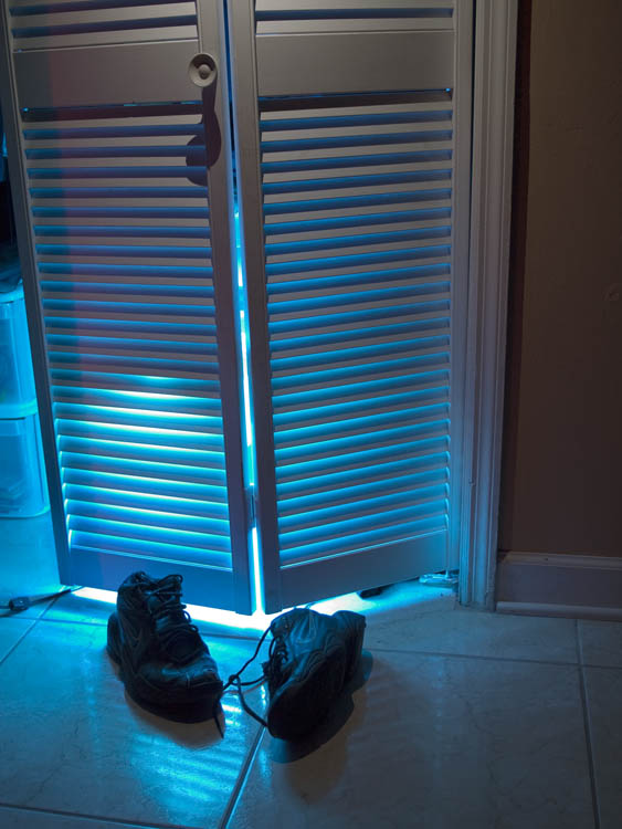
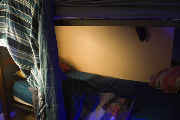
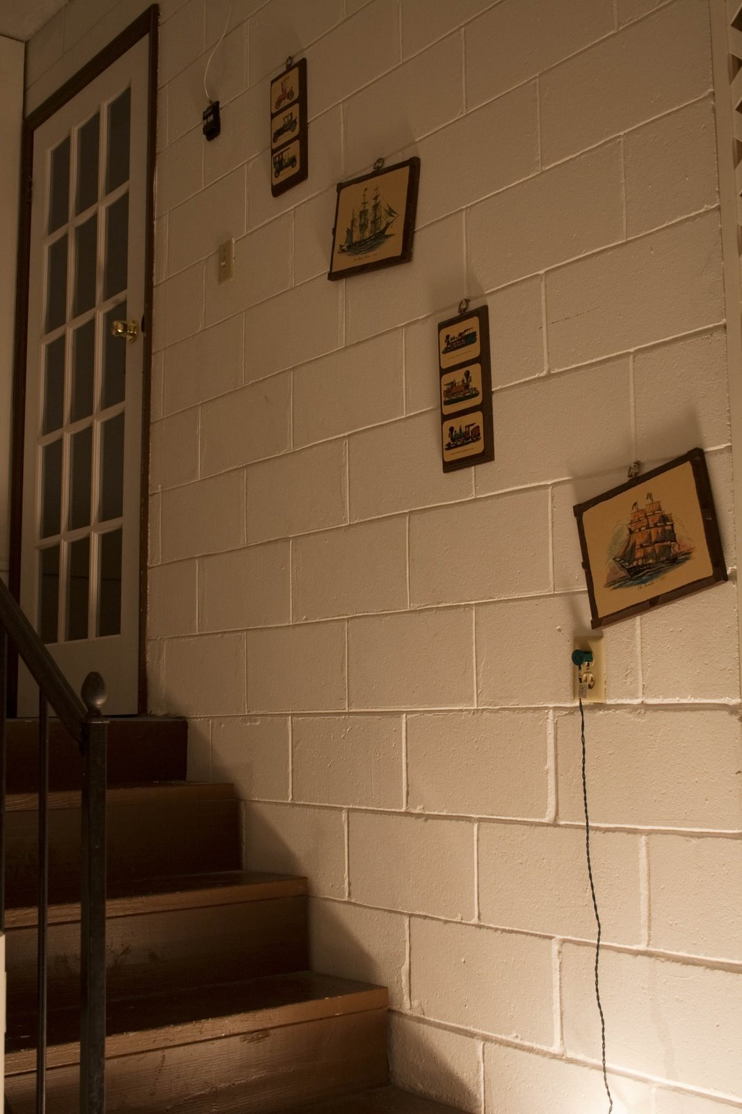
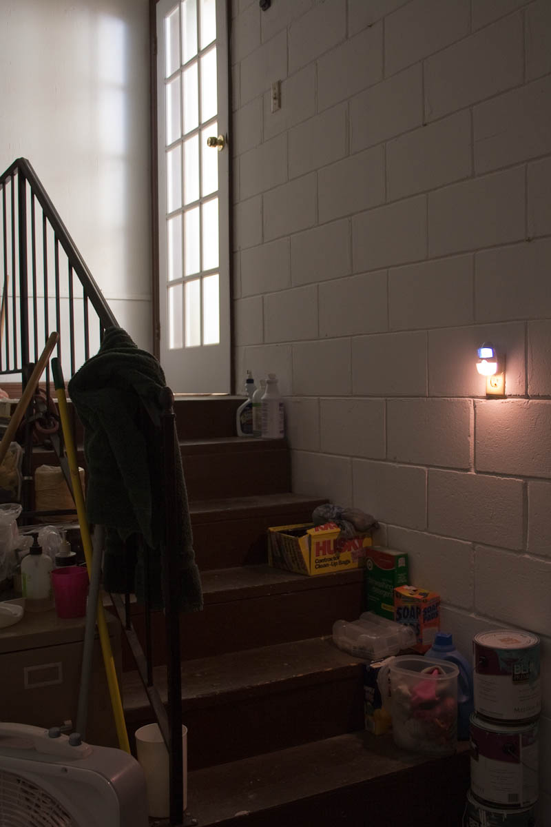
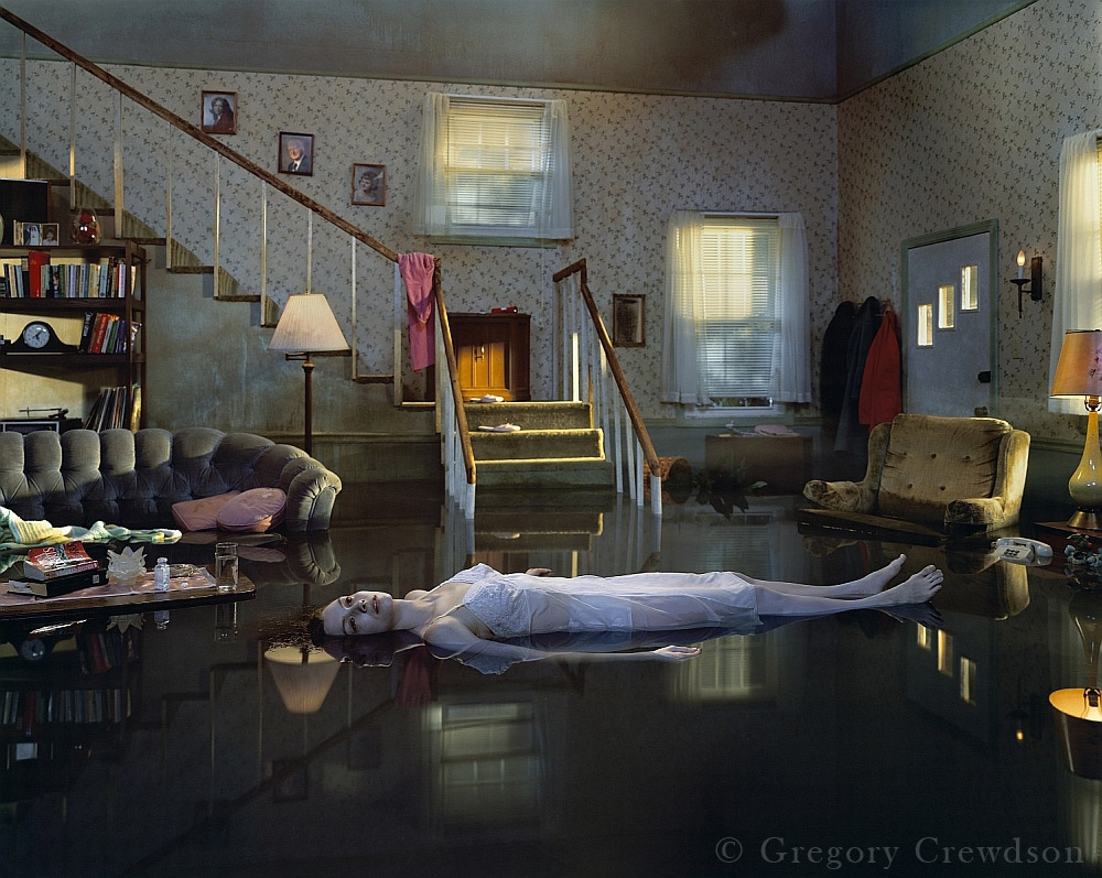
One of noticeable qualities of Crewdson is his attention to lighting. Most evident is the usage of studio lighting alluding the cinema. As mentioned before, the question of what happened before/after the photo is evident in using the medium to tell a narrative like how cinema tells narratives. In the first photo, we see a young boy trying to get something down a drain. The pipe, hammer, screwdriver and nails hint to actions before the photo was taken while the dark blue basement alludes to what might happen after this photo. There is a straightforward element to Crewdson's photos and a bit of mystery as well. The second photo is even more enigmatic with the woman floating in the house. Why is the house flooded? Why is she so motionless; is she dead? The photo has an evident narrative but few hints to its meaning.


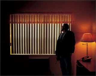
The following photos demonstrate Crewdson's interest of the spotlight. As Edward Leffingwell mentions, Crewdson references Steven Speilberg’s Encounter with the Third Kind with the spotlights appearing like aliens. The third image of the group is most evident of this alien encounter quality with the strong light source emerging from the night sky and the lone person perplexed and looking into the light. The first image is interesting as it turns the source upside-down and has the light beams emerge from the ground. Yet the effect seems to still reference a similar idea.


Another focus of Crewdson is the preference of photographing during dawn, in between night and day. Twilight describes the time as a moment of dreams and the unknown. Here the decision to photograph during this time enhances the image. The photo of the pile of flowers has a dreamy quality with this unusual grouping in the street with the people aware of the strangeness of the scene. Likewise, the second photo may have different lighting to the first but it too is taken between night/day. As a result, the artificial lighting of the house and bus have a staged look and appear to unnatural.


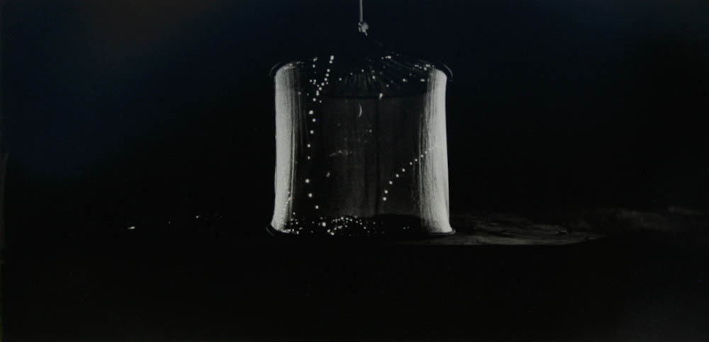
We can see this dreamy quality and attention of light in his photographs of fireflies. While visually these photos may appear different, b/w instead of color and an absence of people, the thematic elements are similar. We are presented with a fireflies in nature but are left pondering of their meaning. The illumination of the flies allude to the stage lights of Crewdson's other photos and we can imagine these photos being taken at twilight as well.


Crewdson, Gregory. Fireflies. New York City: Skarstedt Fine Art, 2007. Print.

Crewdson, Gregory. Twilight. 1st ed. New York City: Harry N. Abrams, 2002. Print.

Edward Leffingwell. (2000, July). Gregory Crewdson at Luhring Augustine. Art in America, 88(7), 103-104. Retrieved October 3, 2010, from Arts Module. (Document ID: 56359101).

Pincus-Witten, R.. (2008, September). Gregory Crewdson. Artforum, 47(1), 457. Retrieved October 3, 2010, from Arts Module.

"Gregory Crewdson." White Cube. N.p., n.d. Web. 3 Oct 2010. website

"Close Up: Gregory Crewdson." Art Forum. Web. 3 Oct 2010. website

All photographs are untitled and by Gregory Crewdson.

Friday, September 24, 2010

Critique #1

My initial idea for my project is to convey a human presence and the idea of transition through still inanimate objects. Possibly by telling a narrative within the objects.

In this photo, I wanted to show a human presence by having the finger marks showing signs of a person once present.


In this photo, I wanted to continue with a human presence, but wanted the writing on the ball to show a better sense of identity. This one appears more personal than the previous photo.


This photo seemed to be the class favorite. I suppose since this picture had a greater sense of transition, a human presence and most importantly appeared to be more natural. The first two photos had a more staged look.


I liked how this photo had an aged look and the worn out sign conveys a feeling of time passing. The inclusion of the glare made the photo as a whole look more "snapshot" like.


This photo is more direct and shows the idea of transition but including moving tool and a plastic covering over the objects in the background. I liked the cleaned look among the mess of the scene.


After the critique, I feel the most powerful/successful images were the third and fifth images. There was a noticeable lean towards the third. I agree, and feel that those two images, possibly the forth as well, has the strongest narratives which enhances the possibility to convey transition. I plan to explore the approach of creating order in chaos and see what kind of images I get. I would also do some simple compositions of single objects, but feel that the former might be more successful.

Thursday, April 22, 2010

Course Reflection

My initial feeling towards the course was uncertainty. I never took a service learning course and didn’t know what to expect. Likewise, I didn’t know much about aphasia and how the clients would behave. I must say that I was very surprise of how talented Bennett and mine client was at photography and her ability to perfectly frame the composition. The first photograph of the door and wreath was very impressive. I was also impressed by the other clients’ improvement in their photography and their ability to communicate with images. The last project about the narrative showed how they can really communicate with pictures quite successfully.

Overall, the course was a good experience and provided a different perspective towards photography. It is easy to overlook the simplest tasks that photography accomplishes. The course was also an eye opener for aphasia and taught me about a disorder that I knew nothing about before signing up for the course.

Independent Project


My project explores the relationship between text and the image (the written language and the visual language). Mainly, my project explores how we visually read text and how lighting, font and framing effects our reading. At the same time, the type of text, or font, totally changes our reading.

My first picture is a good example of how different types of text are read differently. The commercial text of Orlando Sentinel has such a firm placement, completely vertical in the composition and organized. On the other hand, the graffiti text along the Orlando Sentinel moves diagonally and appears more chaotic. Likewise, the graffiti text appears small next to the Orlando Sentinel and has a personal feel unlike the commercial text.

The second picture is a nice experiment with light and how lighting can totally change an image. For this picture, I put a newspaper over a window as the sunlight went through the newspaper. As a result, the newspaper has a transparent quality which allows for the text on the back to seep into the front. This transparency creates a chaotic feeling in which text overlaps other text and the viewer becomes oversaturated with all the information. This kind of portrayal connects with the subject matter of the newspaper in which people are flooded with news all the time. I feel the newspaper text helps enforce this connection.

The last picture is my personal favorite due to its subtlety. The picture is of an abandoned train in downtown. Yet, without me stating this, the viewer can at least tell the object is old due to the dust. What I like about the picture is the ghostly words written on the dust and the elegant motion of how they move along the train, fading away at times. The overcast lighting adds to this ghostly feeling that is created.

Beyond these three pictures, I wanted to create unity through design choices. The addition of red in all the pictures helped make the picture unite as a single series. I also sequence the pictures to move from warm colors to cool colors. The three pictures I chose have the same transition with the bright red of the first to the cool tones of the third picture.

Wednesday, April 7, 2010

Narrative


I chose the following three images because I found them to best tell a narrative. I had some other images that I personally preferred due to their aesthetics but their narrative was not as strong. Initially, I decided to have a picture of myself in bed and the clock to tell the narrative. I believed that the two images by themselves was able to tell the story. As a result, I had difficulties coming up with a third image that would fit in the narrative. I was exploring with photos of me getting out of bed, but I felt they did not fit with the style of the other two. In the end, I chose the window, because I felt that the light from the window would connect with the photo of myself. One of the concerns was whether the middle photo will fit with the other two. The middle one is the only photo with a person. However, I felt that the usage of the close-up and the prominence of the blue blanket over my face covered some of the human presence.

Friday, March 26, 2010

Independent Project

My project will be a series of 20 photos that will explore the interaction between the written language and the visual language. Mainly, how does words visually communicate something? I used a mixture of graffiti text, commercial signs and different languages. So far, I went to Colonial and took photos of signs, graffiti, English letters and Vietnamese characters.
Below I have two approaches. One is a more graphical approach in which there is no outside context. The other one is more reliant on the scenery. I know that people in the class liked the one on the left, but do you think that the series can have both styles and still seem unified?


Another question is about the readability of the text. Should the text be readable or should I crop the text? If the text is not readable, then the viewer must interpret the words based on the visual elements.

My last question is about one last image. This photo wasn't shown in class last time and I was wondering if it fits with the rest. I was thinking of comparing photos with text. In this photo, an old Vietnamese photo is next to graffiti text. What do you think? Does the style match the rest?